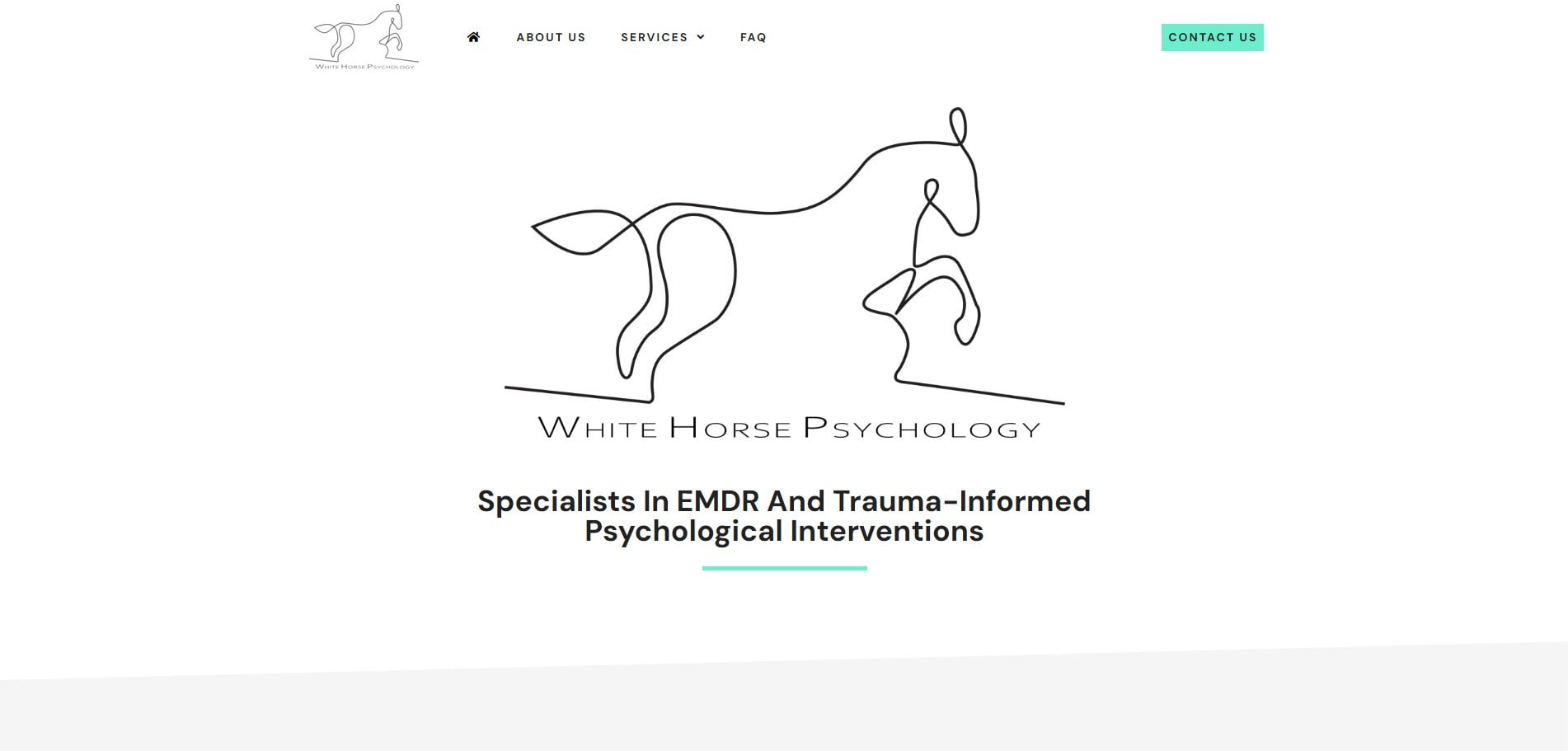
Emma came to us with a special brief: build an online presence for her new venture, White Horse Psychology, but do it in collaboration with her husband — an accomplished artist whose line drawings were to be woven through every page of the site. The artwork wasn't decoration; it was central to the brand identity.
We chose a striking monochrome aesthetic as the foundation, so the line drawings could lead the visual story without competing with bolder design elements. To balance the aesthetic with the practical need for conversion, we introduced careful splashes of colour as visual cues — drawing the eye toward booking forms, contact calls, and the key next steps Emma wanted visitors to take.
The result is genuinely one of a kind. You'd struggle to find another psychology practice with a website that feels like this — and that's the point. Emma's site doesn't look like the dozen others her prospective clients have already clicked away from, and the artwork gives it a quiet warmth that the practice itself reflects.